

New Birth Baptist Church Makeover
developed for New Birth Baptist Church, Miami, FL
Working on visual identity projects often requires faith. On this particular assignment, I worked on redesigning a Faith-based client’s look. New Birth Baptist Church in Miami, Florida was considering revisiting it’s logo design for the 21st century. I was brought in as a designer and consultant to bring the new look to life.
Working with faith-based clients can be challenging, and requires a lot of patience and good listening skills. Ninety-five percent of the time you’ll be assigned a committee comprised of staff and volunteers with distinctly different personal tastes. So making the pitch required a flexible approach with friendly, non-technical conversation.

New Birth’s original logo had been in use since the founding of the church. It’s elements involved a dove, an oblong circle, and a font that gives a nod to Star Trek®. Much of the text is too small to read, and doesn’t have much impact as a component of the logo itself.

After reviewing the needs of the brand, a few concepts were considered. The primary thought, from the beginning, was to minimize the amount of copy, and maximize the identity. The goal became to create something iconic, memorable, and distinct. Here’s how the idea unfolded.

From the start, the goal was to reduce the long, cumbersome name to an acronym, choosing to emphasize the image of the organization through it’s good works and association with it’s celebrated clergy. After working through several rough ideas, the decision was made to move forward with these 3 versions:
![]()
![]()
![]()
Each of these was reviewed for its impact and ability to stick in memory. It was decided that the third option be pushed forward.

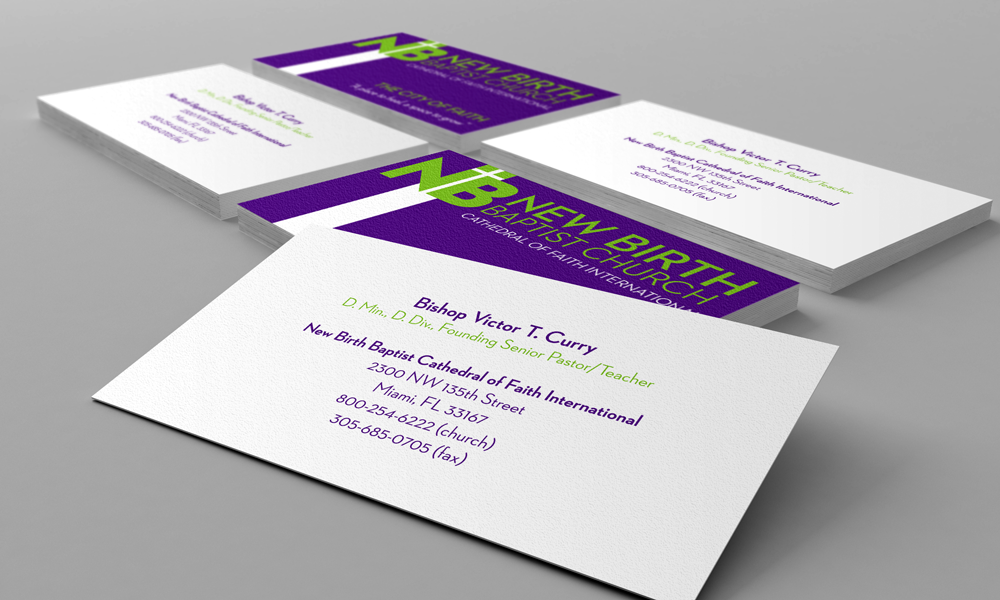
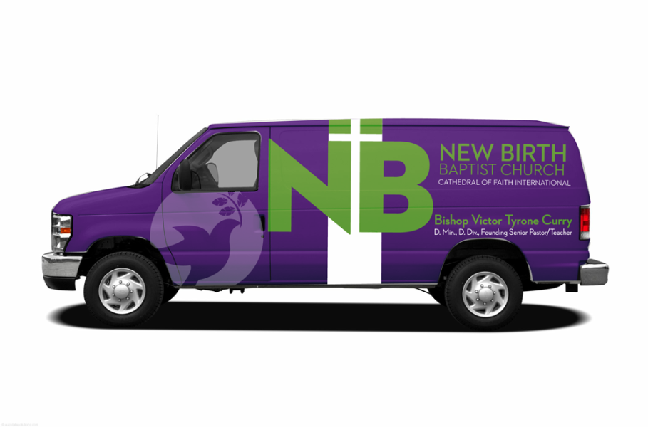
Using the negative space between the N and B capped by 2 squares, cleverly result in a well placed cross. The font was simplified to a san-serif face to make the logo stand out. Ultimately, the logo will be able to stand on its own, with or without the text below it. From this nucleus, the following ideas emerged:
-
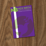
- Church bulletin cover art
-
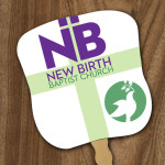
- Fan front
-

- Mailing envelope design
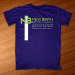
Three other concept designs were presented to solidify the flexibility of the design. We presented the design on a t-shirt, an outdoor billboard, and finally, in a new interface for the website.


Unfortunately, the organization chose not to update it’s brand at this time, but we were told that our presentation was very strong and amy be considered at a fewer time, when the makeover will be revisited.
- Client - New Birth Baptist Church, Miami, FL
- Date Completed - June 11, 2012
- Skills/Tools Used - Adobe Illustrator Adobe Photoshop