
The SOTO Group Visual ID
Creating a visual identity for any client requires a lot two very important factors. One is listening, the other is patience. Arriving at every solution requires cooperation from both the designer and the client. The level of trust from both sides is always an issue, but the solution will always answer the call. Here’s how we solved the Soto Consulting Group LLC.
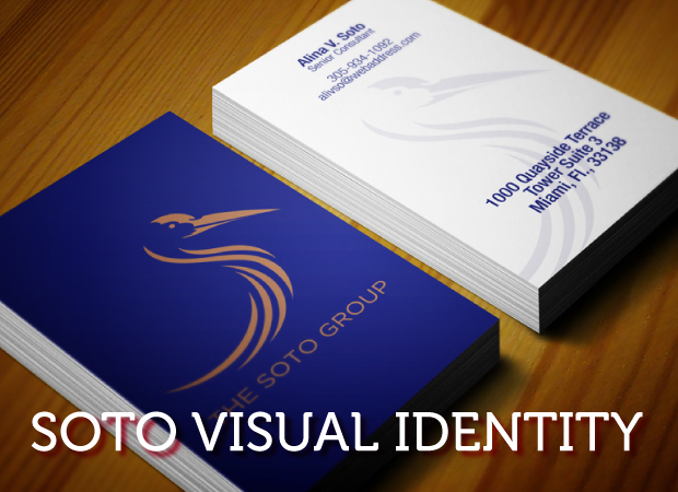
The Soto Group is a new consulting firm that pushes for the professional and personal ethics in the areas of early childhood education, all forms of mediation in Florida and relationship sales and management. The logo need to reflect founder Ms. Soto’s “personal” vision of the company’s image, as well as its goals and objectives.
I like scribbling down words that are mentioned repeatedly in a briefing. The client always looks for those terms to become visual elements of their product.
The terms that popped up more than others were ICONIC and CRANE. I started working on multiple iconic symbols first, just in case they wanted to keep the visuals simple and focused on the name.


However, the crane was to be the primary element and not the secondary symbol. Ms. Soto discussed the meaning of the crane to me at great lengths. There were several spiritual messages associated with this majestic bird. It seems the Crane is considered a messenger of God, or a symbol of communion with God, or Light Beings. It represents entering higher states of consciousness. In China, it represents immortality, long life and happiness. In Ancient Greece and Rome, the Crane was sacred to Apollo and was a herald of spring. In Christianity, it represents goodness, loyalty, good order. The mysterious Ainu people of Japan perform a ritual crane dance as do the people of Korea. The crane is often seen in traditional Japanese art. Finding as much as reference as I could, I began to sketch out my crane concepts.


Once I got the crane I thought was working, I began to develop visual elements around it. However, the client though the crane was too elaborate and needed less detail. After more internet research, I started working with the essence of the crane and stripped out the nonessential stuff. Here’s what I ended up with:


The crane was approved, and the colors were modified by the client. here are a series of mockups I presented for final review and approval:
![]()


We would love to hear your comments