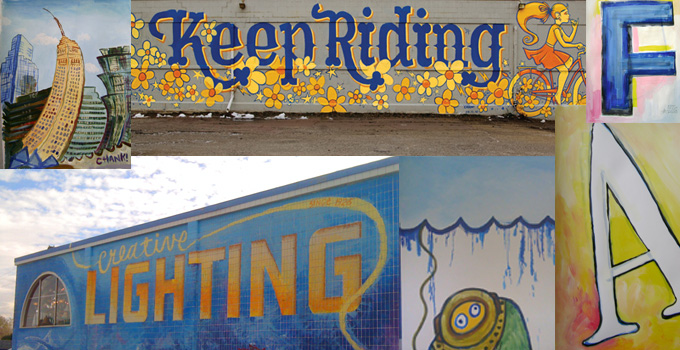
Chank Diesel Interview

MyFonts has posted a great interview of one of my favorite typographer/designers Chank Diesel. Go check out the full story here. Here’s an excerpt:

How did you start working with type in the first place?
I was working on a music magazine called CAKE back in the day, and I created some fonts for myself to use in the magazine. When people saw those fonts, they wrote to me asking how they could buy them. I never set out to be a font company; I was just a guy making fonts. But once I started selling fonts, I put more effort into it.
I’ve always enjoyed working with the alphabet. I learned from watching Sesame Street, which has been there my whole life. I’m a lefty, so my handwriting is naturally awful. In 6th grade I was held back after school to work on improving my handwriting and that was my favorite part of the day. And since I was told at an early age that my handwriting is not so good, I’ve been working my whole life at improving my type-drawing skills, and I think I may have over-compensated a bit.
You’re a specialist of what people call “fun fonts.” Many type designers of your generation gradually abandoned the fun stuff for serious book faces and large families. Do you have any ambitions in that direction?
A serious book face? Like for books on paper? Hahahahaha! Nah, not really.
Seems to me it’s more important to make fonts that look good on phones, iPads, Kindles and other electronic devices. The fonts made for those devices will look very different from serious book faces, but I hope they won’t look all bitmappy and grid based. I want to make human-inspired fonts that look good on digital devices; that’s much more important to me than making a fancy book font.
I always imagined I’d spend ten years at some point making a fine, seriffed text font that would exemplify all my skills and flair and serve readers for generations to come. But as of today I just have no interest in working on a font like that. I would, however, like to make a display font with multiple serifs on each stem; I’ve got a font like that in my head, but I’m pretty sure that’s another fun font, and not a text font.
I like making large font families and do those sometimes, but those often confuse the casual font user, and I don’t want to alienate those people. Most people can grasp regular, bold, italics and bold italics. When you add mediums and extrabolds and superlights and condensed and extendeds and all that stuff it’s like you’re pandering to fancy-pants high-end designers, and they don’t really want to use my fonts anyway. So I try to focus more on original, flashy, display fonts that come in a single weight.
I do also really enjoy adding extra language support to my fonts, so more people can use them. I’ve added Central European character support to many of my fonts, plus a few sets of Cyrillics. I wish there was more money to be made making Cyrillic fonts, but I haven’t really found a way to monetize that yet. But I really love the Cyrillic alphabet; those backwards Ks are so cool, and I love the small-cap style in some of the lowercase letters.
Want more? Head over to MyFonts and get the whole interview.

We would love to hear your comments