


Ladies Nite Out USA Visual ID
developed for Armstrong Creative Consulting Inc.
Ladies Nite Out USA was a great opportunity to incorporate design with a high profile social presence. The opportunity to design for an organization created, formed, and established by a team of brilliant women pose a great task for me to stretch and reach a new level.
Ladies Nite Out is a worldwide network by women for women. The mission of LNO is to promote and support communication and sharing among women of all ages, races, cultures and creeds. It is a network, whose members have access to discounts and special offers for venues, activities, and services. Here’s a quote from founders describing the origin of LNO:
Ladies Nite Out was formed by a group of friends who came together at the end of a day for a traditional “Ladies Night Out” after work. While sitting, talking and sharing our day, we observed many other groups of women engaging in the same activities around us. We realized that how wonderful it was for women to get together and how nice it would be to be in a supportive environment, in a place that would realize the financial contribution women made and offer a gift, a discount or some form of incentive to use their place or facility. We realized that often we did not know where we wanted to go and usually went to the same places for lack of knowledge. The idea of going to a single web site that had a calendar of events and ideas for Ladies Nite Out would be extremely useful. In that moment- Ladies Nite Out was born.
The design started simple enough with a few basic sketches to get the feel before the look. Getting a feminine, inclusive feel was crucial to the brand’s success. I went through several sketches but kept the general idea of an acronym as my base.

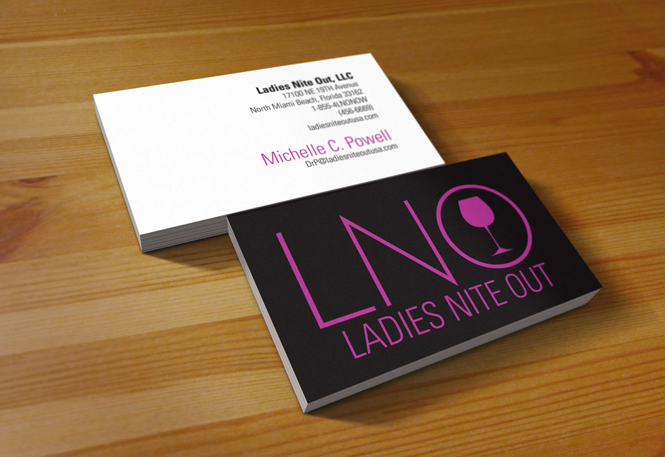
Early considerations were for a cursive look, mimicking a soft, handwritten feel. The concept eventually turned towards a thin font. A martini glass subtly placed in the “O” got their attention. The vessel eventually evolved into a Burgundy glass.

Once the logo was selected, it was simply a matter of primary color choice. The ultimate winner was fuchsia.
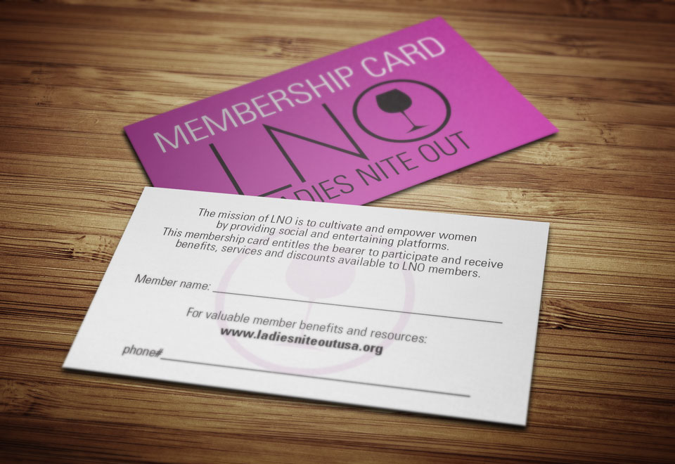
The visual ID was rounded out with all of the essentials, such as a letterhead, envelope, membership card and fully interactive website, complete with a member login. I enjoyed the process and looked forward to eventually working with them again.
- Client - Armstrong Creative Consulting Inc.
- Date Completed - February 24, 2013
- Skills/Tools Used - Illustrator, Photoshop, Wordpress