Vision to Victory Logo Makeover


Vision to Victory – Destination H.O.M.E. Housing Program is a FREE housing service that will assist you in foreclosure prevention and mortgage options. Home-ownership is one of the most fundamental and common dreams of Americans. The program highlights: Credit Counseling, Pre-Purchase Counseling, Home Buyer Certification and Foreclosure Prevention Counseling. This was the previous definition. The organization was expanding its services to go beyond housing and wanted a logo to reflect their larger scope.
Here is the new dialog brought in to the discussion by the client:
Vision To Victory Human Services Corporation (VVHSC) is a 501©3 not-for-profit organization incorporated in March 1996. The mission of VVHSC is to provide activities that will empower families and strengthen communities. An outgrowth of the New Birth Baptist Church Cathedral of Faith International Ministry of Social Concerns, VVHSC is committed to strengthening families and communities utilizing education and training; and community and economic development activities that will enhance, preserve and restore family unity, self-sufficiency and sustainable communities. VVHSC is a HUD Approved Affiliate Member of Mission of Peace National Corporation, a HUD Approved National Intermediary for Housing Counseling.
VVHSC has a wide array of service delivery experience in programs ranging from early childhood development services; academic enhancement programs for junior high school children through kindergarten; job develop and placement services; and targeted HIV/AIDS and other health related educational services to the community.
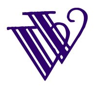
The image previous used to overlapping “V”s done in an antique font face, evoking more Great Gatsby than personal and community services. The redesign was decided to be more contemporary, but still compact and memorable.

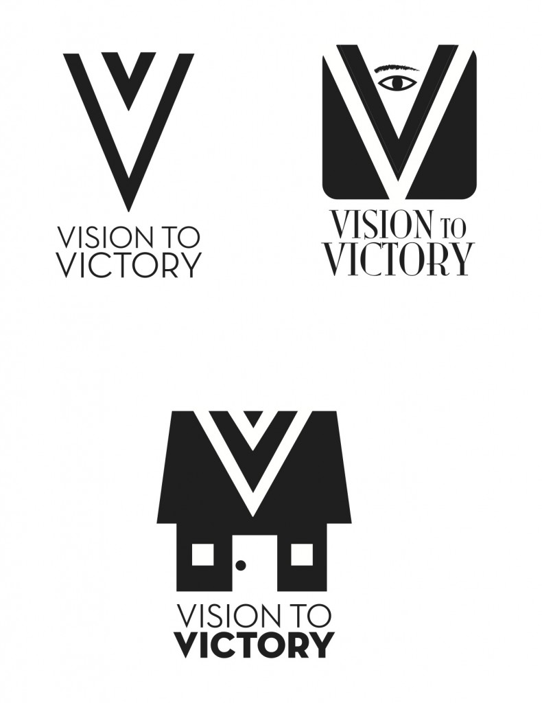
We submitted the first set of ideas. The client liked the direction from these 3 ideas, and liked the bottom “house” the most. But they were concerned above the reference to housing only, and wanted it to be more versatile. After review they thought the new double ‘V” looked good, but thought the eye was a bit creepy. I agreed. We revised it.

In this set, we provided variations on the two Vs, since they appeared to be interested in keeping the feel of the previous design, but altering it visually for a better design. By the end of the presentation, they discovered the simpler double V (upper right) was the way to go.
Card Concepts

We pitched a front&back design, in hopes that people would want to keep the card, and second guess throwing it away once the info went into their smartphone. They took a few days to hash it out before coming back with the lower right card concept as their choice. The only change way to change the colors to the official burgundy shade.

Once the card was approved, we developed the full stationery package around it.

The final piece was a promotional brochure, promoting the services of V2V.


currently there's 2 comment(s)
Ellen Smith
commented on April 7, 2012 at 8:50 pm
Hi Professor Grant,
Love your website. It’s very easy to navigate and your designs are amazing.
Take a look at this sentence:
We pitched a front/back design, which would entice people to want to keep the card, and second guess throwing it away away the numbers went into their smartphone.
samsayshi
commented on April 8, 2012 at 11:00 am
Yikes!
That’s REALLY a bad sentence. I think I’ve cleaned it up. Thanks!