Cadson Demak’s Kurry Pro

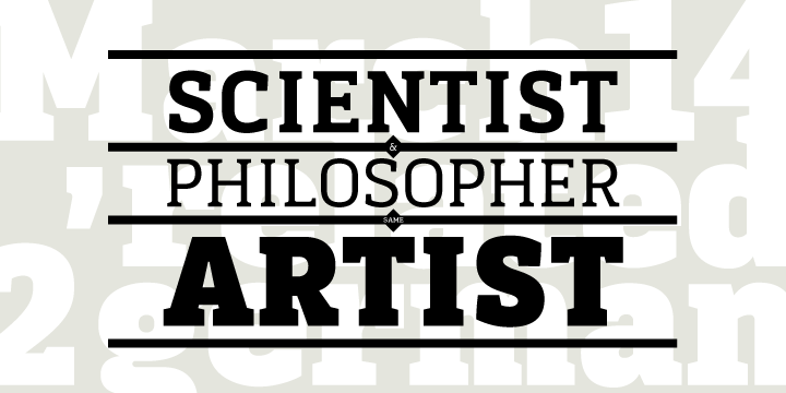
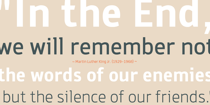
Kurry Pro has been one of the surprise sellers at MyFonts.com of the past couple of months. Among the many no-nonsense sans-serif fonts that have come out recently, it stands out as a rather exotic hybrid. Its basic structure is simple — a narrow rectangular skeleton rounded at the top and the bottom — but its somewhat quirky details set it apart. Terminals end in a softened point, as do some strokes where curves join straight stems; many letters have a swashed alternate version, and special English-language keywords such as “with”, “of” and “by” (the latter two in upper- and lowercase) add to the font family’s versatility.
About the Font’s Design Firm
Cadson Demak is an image planning firm with typographic service based in Bangkok Thailand founded in 2002.
Introduced in in 2006, “Cadson Demak Distribution” a group of custom Thai type designers working together hand in hand to set up a common ground for digital type design business in Thailand. Cadson Demak Distribution gradually becomes typographic supplier for most of Thailand’s leading brands such as Tesco Lotus, Wallpaper magazine (Thai Edition), Men’s Heath (Thai Edition), ThaiBev, Chang Beer, AIS, Communication Authority of Thailand and Dtac (Telenor Thailand).
If you like this typeface from Cadson Demak, check out some of their other fonts:
Kondolar

It’s easy to let Kondolar’s occasional swooping descender trip you up, but that shouldn’t distract from what is essentially an uncomplicated, multi-purpose text-and-display slab serif. The option of flourishes on K, Q and R adds a dash of adventure to the workmanlike slabs.
Due

Launched in December 2011, Due is Cadson Demak’s latest take on the genre of the humanized businesslike sans-serif. Its open shapes, agreeable curves and clear, rather wide italics make it a good choice for display and basic text settings in corporate as well as editorial design projects.
Knight Sans

With a rounder overall character than some of Cadson Demak’s other sans faces, Knight Sans would be a good candidate for corporate publications, special print projects and websites. It holds up well as a varied text face possessed of enough character and individuality to escape bland conformity.

We would love to hear your comments