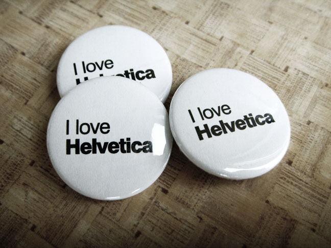
Helvetica: The Movie

Finally. A movie about the ultimate font. No matter how much you curse it, dimiss it or criticize its lack of personality, I still think it’s still the greatest typeface in the world. And now there’s a movie that reinforces my beliefs. And it’s properly titled Helvetica.
Helvetica is a feature-length independent film about typography, graphic design and global visual culture. It looks at the proliferation of one typeface (which celebrated its 50th birthday in 2007) as part of a larger conversation about the way type affects our lives. The film is an exploration of urban spaces in major cities and the type that inhabits them, and a fluid discussion with renowned designers about their work, the creative process, and the choices and aesthetics behind their use of type.
Helvetica encompasses the worlds of design, advertising, psychology, and communication, and invites us to take a second look at the thousands of words we see every day. The film was shot in high-definition on location in the United States, England, the Netherlands, Germany, Switzerland, France and Belgium.
Interviewees in Helvetica include some of the most illustrious and innovative names in the design world, including Erik Spiekermann, Matthew Carter, Massimo Vignelli, Wim Crouwel, Hermann Zapf, Neville Brody, Stefan Sagmeister, Michael Bierut, David Carson, Paula Scher, Jonathan Hoefler, Tobias Frere-Jones, Experimental Jetset, Michael C. Place, Norm, Alfred Hoffmann, Mike Parker, Bruno Steinert, Otmar Hoefer, Leslie Savan, Rick Poynor, and Lars Müller.
About the Typeface
 Helvetica was developed by Max Miedinger with Edüard Hoffmann in 1957 for the Haas Type Foundry in Münchenstein, Switzerland. In the late 1950s, the European design world saw a revival of older sans-serif typefaces such as the German face Akzidenz Grotesk. Haas’ director Hoffmann commissioned Miedinger, a former employee and freelance designer, to draw an updated sans-serif typeface to add to their line. The result was called Neue Haas Grotesk, but its name was later changed to Helvetica, derived from Helvetia, the Latin name for Switzerland, when Haas’ German parent companies Stempel and Linotype began marketing the font internationally in 1961.
Introduced amidst a wave of popularity of Swiss design, and fueled by advertising agencies selling this new design style to their clients, Helvetica quickly appeared in corporate logos, signage for transportation systems, fine art prints, and myriad other uses worldwide. Inclusion of the font in home computer systems such as the Apple Macintosh in 1984 only further cemented its ubiquity.
Sneak Peek (back into 2008)
Click the image below to see a clip from the feature-length documentary Helvetica, by Gary Hustwit. This segment features commentary from typographers Neville Brody and Rick Poynor.


We would love to hear your comments