Olympic Size Logos

It’s old news that Rio won the bid for the 2016 Olympics after a hotly contested race with Chicago, IL. Rio and Chicago had gone into the day considered the favorites, ahead of Tokyo and Madrid. But by the time Rio was chosen by the International Olympic Committee to become the first South American city to host the Olympics, the Chicago delegation and its star-studded supporters were nowhere in sight.
They had already left the building.
Despite the support of President Obama, who flew in specifically to address the I.O.C. voters, Chicago finished last, out of the running in the first round of voting, with a paltry 18 of a total 94 votes. Tokyo received 22, with Rio getting 26 and Madrid 28. In each round, until one city gains a majority, the low vote-getter is eliminated. After Chicago was tossed aside, nearly all of its votes went straight to Rio in the second round. In the third, after Tokyo was eliminated, Rio won handily, 66-32.
This all went down way back in 2009, and most people have gotten over it. As an artist, I find the bids intriguing because of the fabulous logos that come out the competition. All countries have to push their visual campaigns as if they already have the bid, so you get to see some outstanding finished artwork. Here are the logos of the finalist who pitched their butts off for the 2016 games:
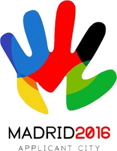
Madrid Olympics Logo 2016:
Madrid Logo 2016 Summer Olympics
Madrid, the capital city of Spain, is among few European countries which has not yet hosted the Olympic games and this time they are trying their level best to grab the opportunity. The logo is named “Corle” and represents a hand in the colors of the Olympics, welcoming foreigners to the games. The silhouette of an ‘M’, representing Madrid, is also hidden in the hand.
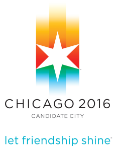
Chicago Olympics 2016 Logo
Chicago is believed to be the strongest contender in terms of infrastructure, support and money. The logo is a 6-pointed star, as found on the flag of Chicago, with colors representing the sun in the sky, green parklands, and blue waters of Lake Michigan.
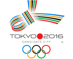
Tokyo Olympics Logo 2016:
Tokyo is very hopeful to host the event for the first time since 1964. The Tokyo bid logo takes the form of a traditional Japanese knot known as musubi. The five Olympic colors are used in the decorative knot; the musubi in Japan signifies blessings during times of celebration.
RIO: The Winner
Logo at Bidding Session:
The logo at bidding session was heart shaped depicting the passion and enthusiasm of the Brazilians for sports. The “Sugar Loaf Mountain”, a prominent landmark of the city was chosen as a symbol of Rio de Janeiro and the logo was thought to reflect the symbol. These two main attributes are expressed more artistically and thematically in the new and final logo design of Summer Olympics Games Logo 2016 (launched on New Year’s Eve at Copacabana Beach) than the one presented at bidding session.
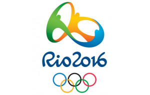
The Final Logo of Rio Summer Olympics Games 2016
Three people holding Each others Hands…
The logo of any international sporting event has to have such elements which reflect the colors of the particular event and the host city. The final logo of Rio Summer Olympics 2016 has embedded within itself both these colors quite beautifully. Just a little deep and close look at the logo can make you understand the embedded theme and here we present to you this closer look in descriptive form.
- Three People: Three people colored as Green, Blue and Orange in the logo present a stylized version of the circles of Olympic Games Logo which represent the people of different continents participating in the Olympic Games.
- Holding Hands in Hands: This symbolizes unity among different nations of the world brought through sports which is one of the slogans of Olympic Games.
- Dancing Mode: All the three people are shown to be dancing which portrays the fun and enthusiasm of Carioca (Rio de Janeiro’s citizens) and Brazilians for sports. It also aims at reflecting the excitement of the Rio’s citizens for the transformation that SUMMER OLYMPICS GAMES 2016 are going to bring to Rio de Janeiro and in turn to Brazil.
- Shape of the Illustration: The shape formed by the internal space between the three dancing people in the illustration is made to resemble the SUGARLOAF MOUNTAIN in Rio de Janeiro. This landmark has been taken as a symbol for the city. The vertical shape between green and orange and the horizontal shape between green, orange and blue, both make up the shape of the Sugarloaf Mountain.
- Four Pillars of the Logo: It has been announced that the logo design is based on four pillars namely contagious energy, Harmonious Diversity, Exuberant nature and Olympic spirit.
The final logo of the Summer Olympics games 2016 is in complete affirmation with the culture and colors of Rio de Janeiro, the host city and the spirit of Olympics Games.
LOOKING AHEAD
The 2020 Games selection process is currently underway. The International Olympic Committee has begun the selection process for the host city. Five applicant cities, Istanbul, Tokyo, Baku, Doha and Madrid, are competing to welcome the Games. The IOC will select Candidate Cities on May 23, 2012. The host city will be elected in Buenos Aires on September 7, 2013, at the 125th IOC Session.


We would love to hear your comments